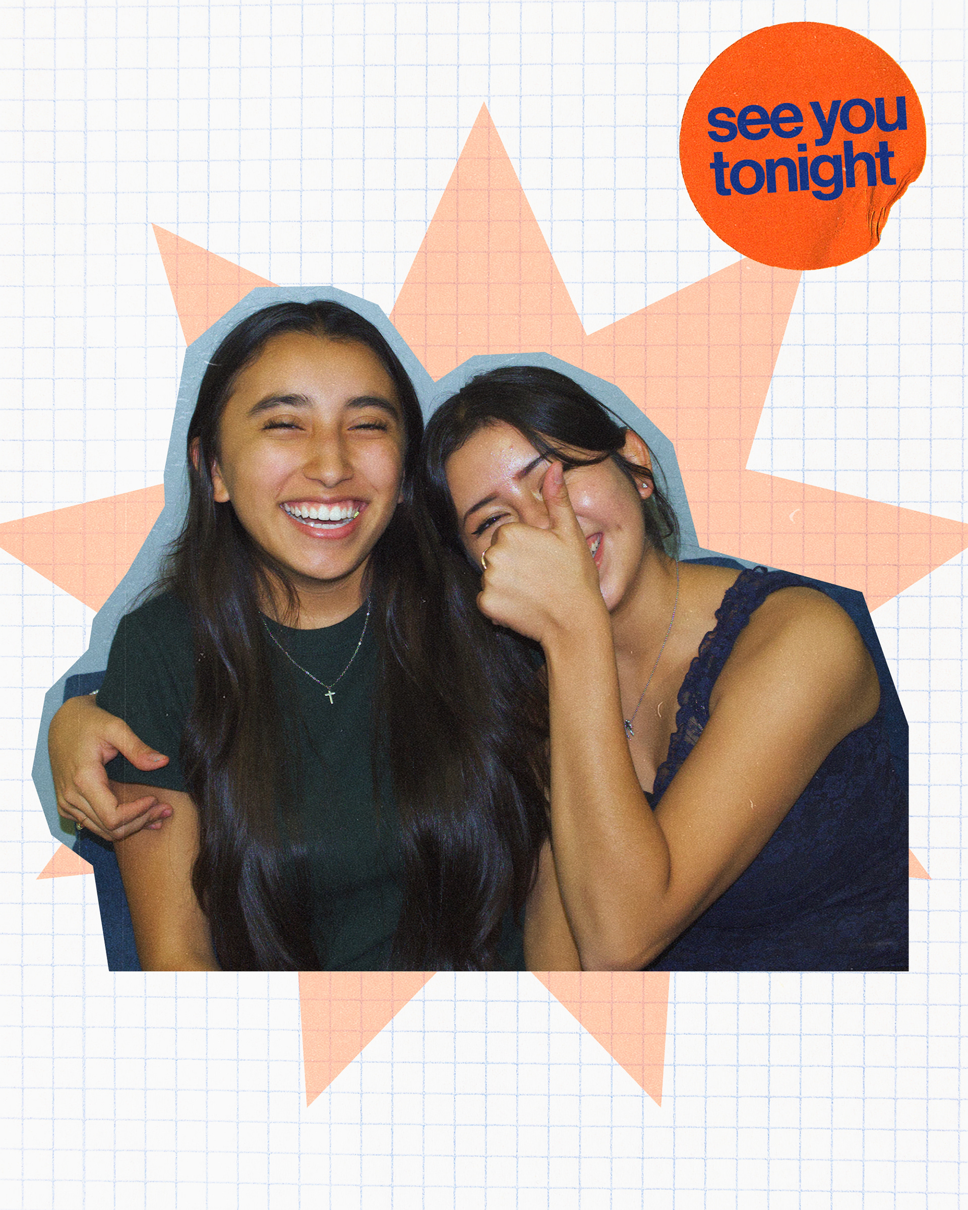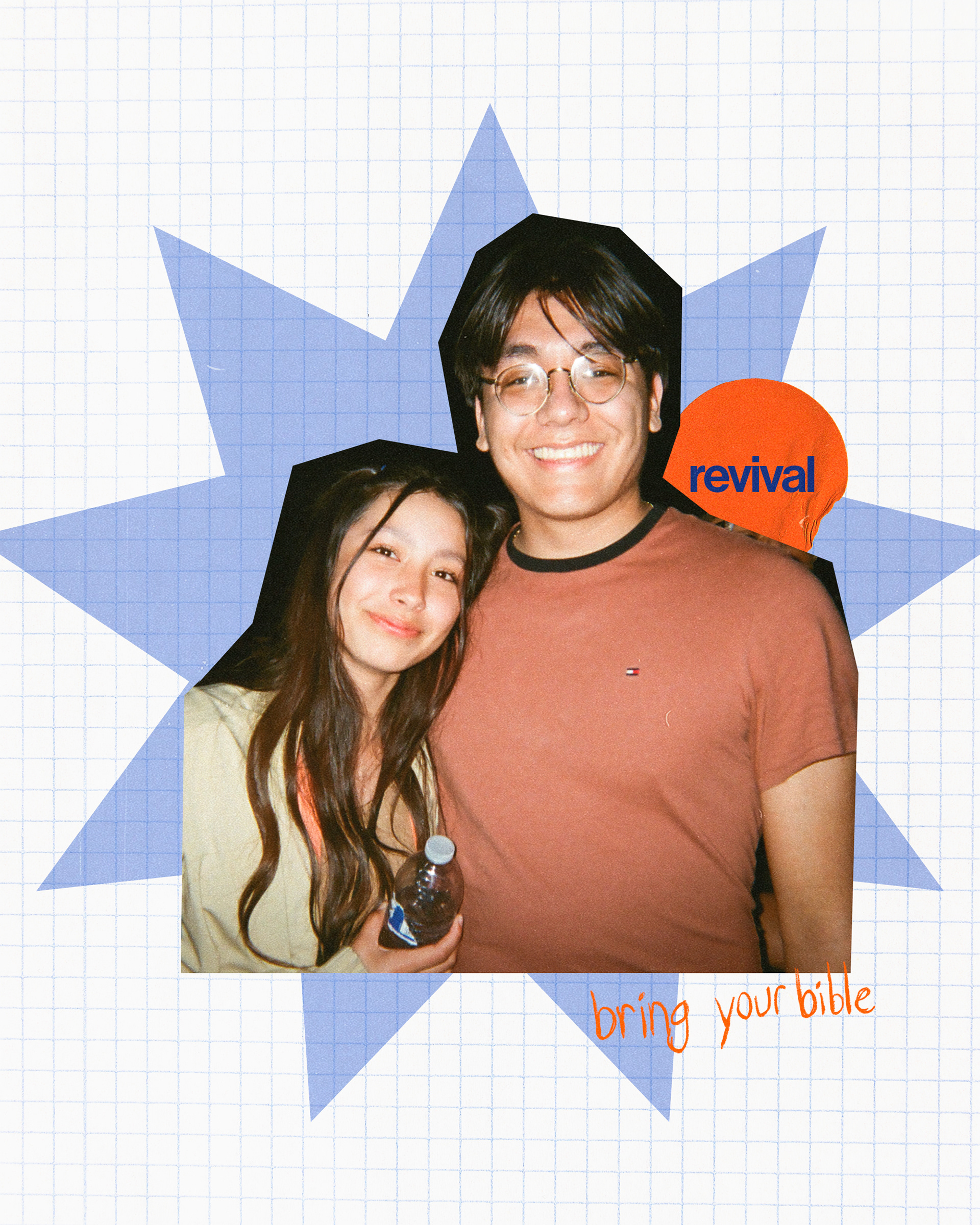
As the head graphic designer at New Day Church, I lead a comprehensive overhaul of our youth department's branding. The challenge we encountered with our previous logo was its limited adaptability across various mediums and styles. This is of high importance because we continually introduce new events with varying themes and styles. Therefore, it's crucial to have branding that can seamlessly adapt to these diverse styles while maintaining consistency and resonance with our audience. It also failed to resonate with our core values, lacking the meaningful significance we sought to convey.

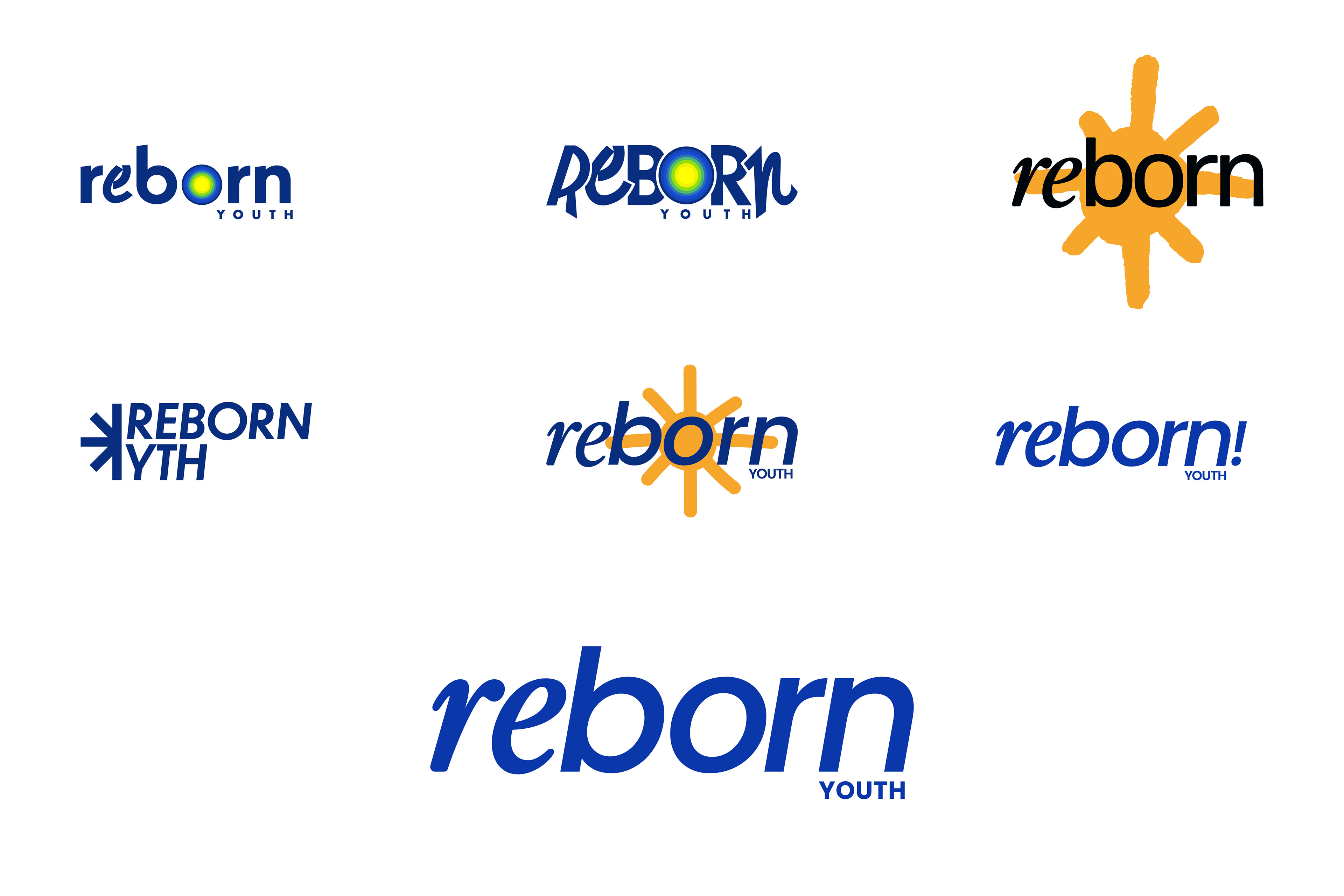
The initial phase of crafting digital logo variations marked an experimental stage. I delved into refining the original concept, exploring avenues to simplify it while retaining its essence. However, I soon moved towards an entirely new style. During this process, I contemplated moving away from the "rbrn" and transitioning towards a wordmark that encapsulates the adaptability aspect central to our objectives.

After receiving feedback from the team, I continued to pursue a wordmark design but with a bolder approach. The initial attempt, showcased in the second concept below, didn't fulfill our adaptability criteria to the extent we desired. I continued exploring various wordmark iterations. Eventually, I achieved a breakthrough that successfully addressed our dual objectives from the outset: adaptability and alignment with our core values.
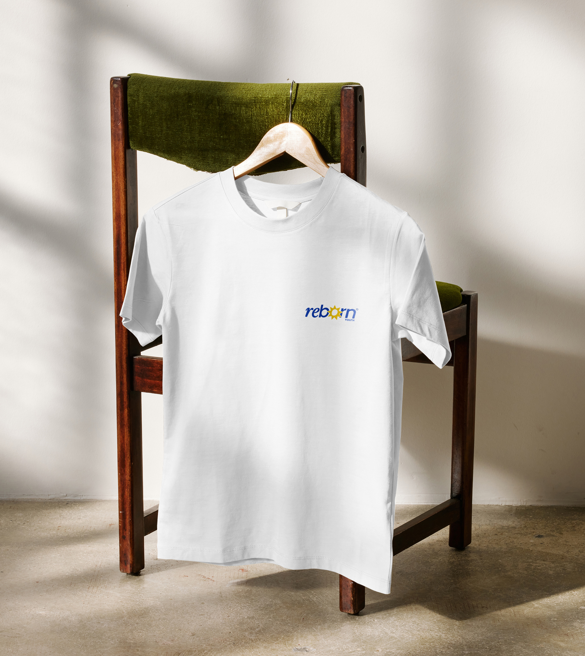
The solution emerged by accentuating "re" with a serif font, juxtaposed with "born" rendered in a sans serif style. This approach struck the perfect balance, encapsulating our brand essence while ensuring versatility across different contexts.
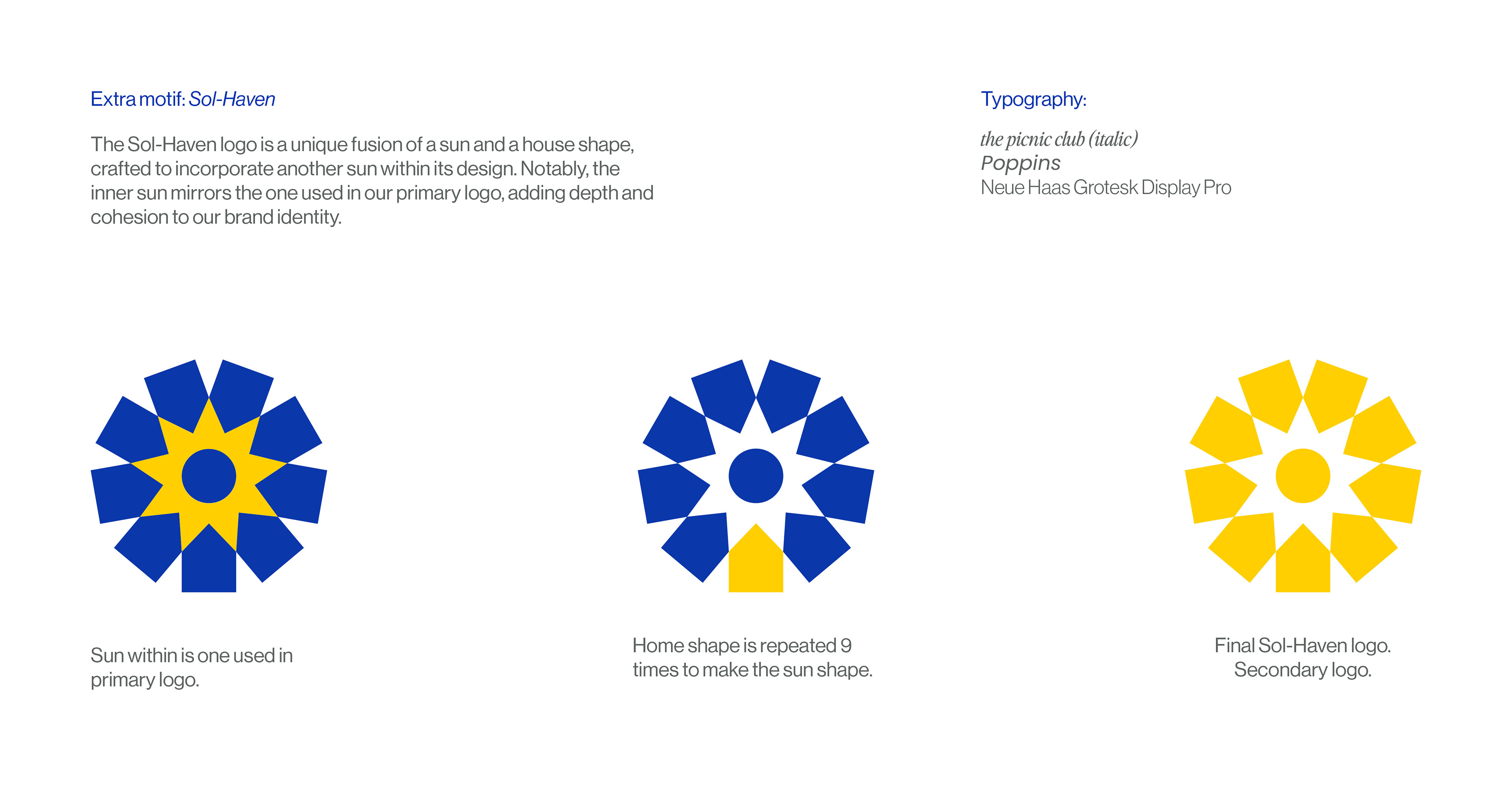
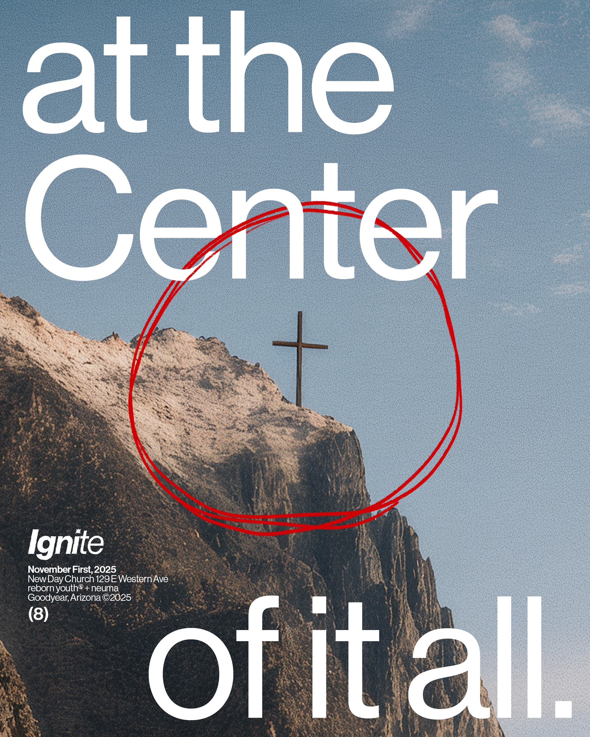
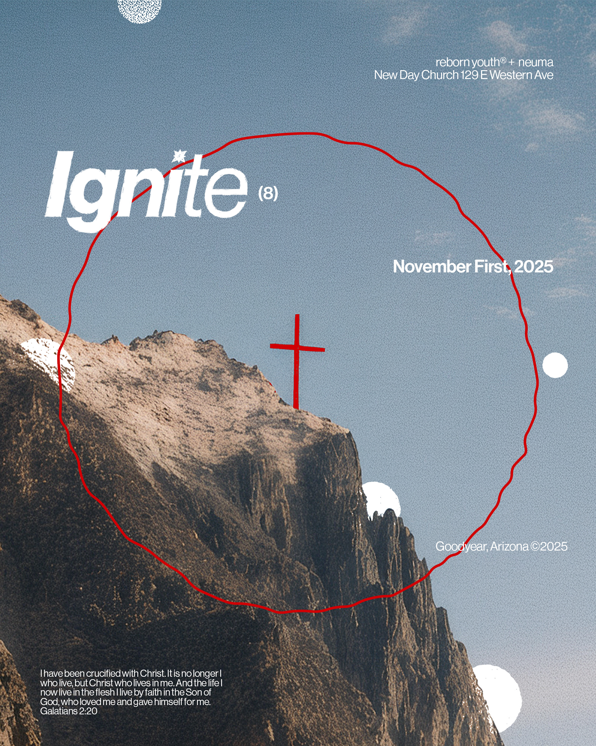
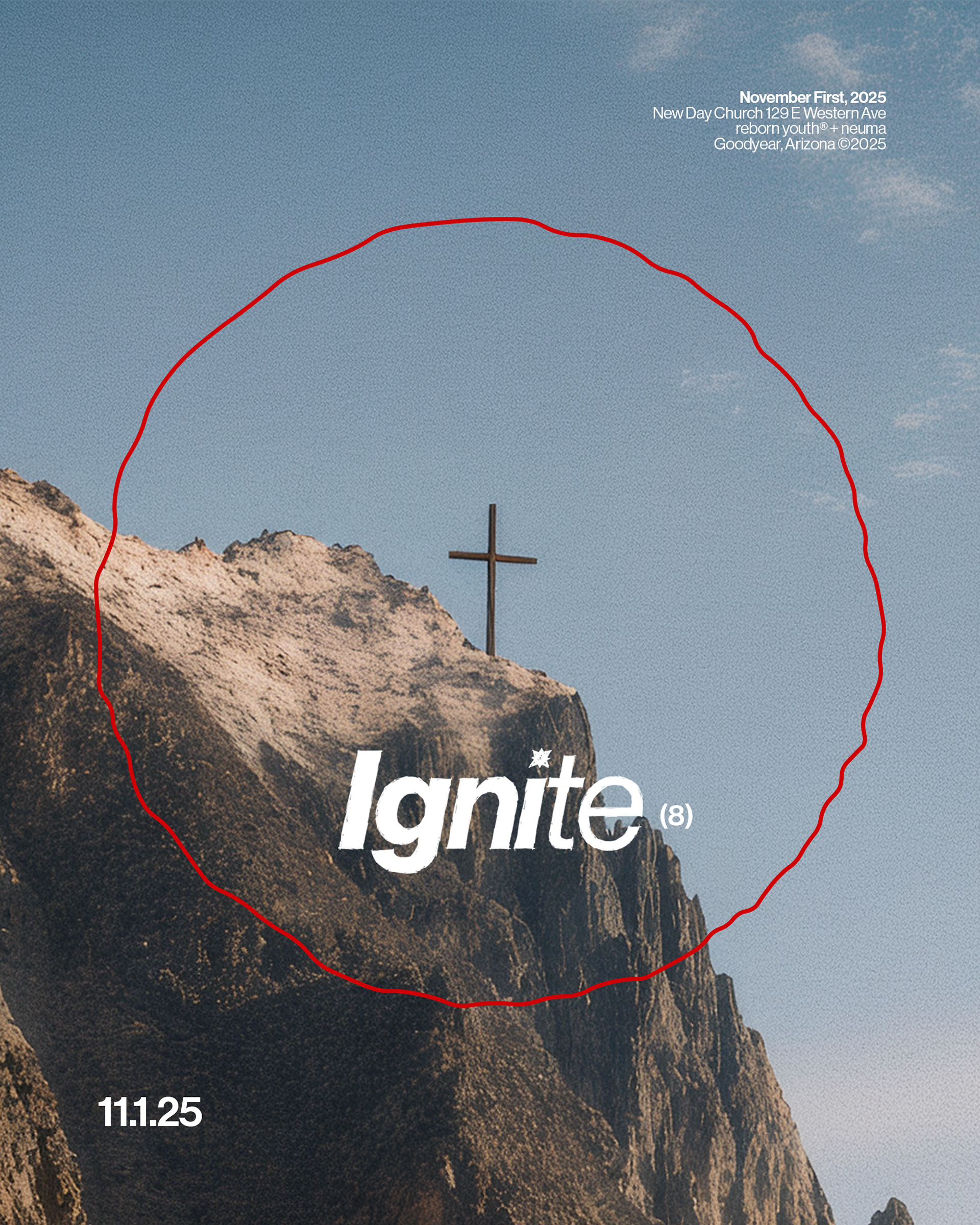
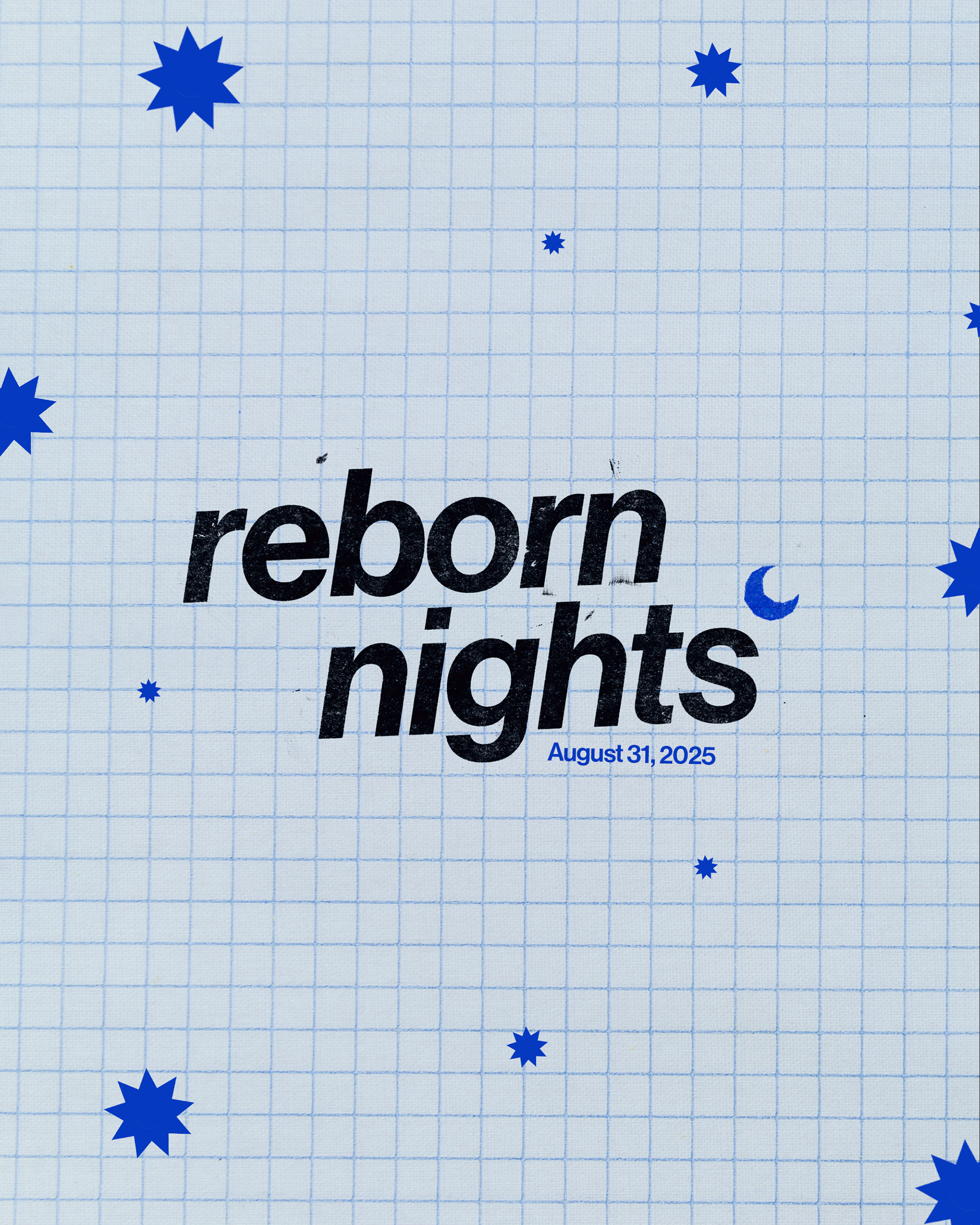
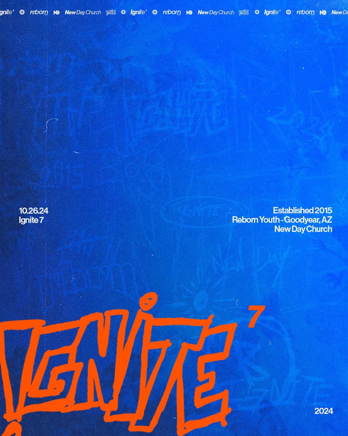
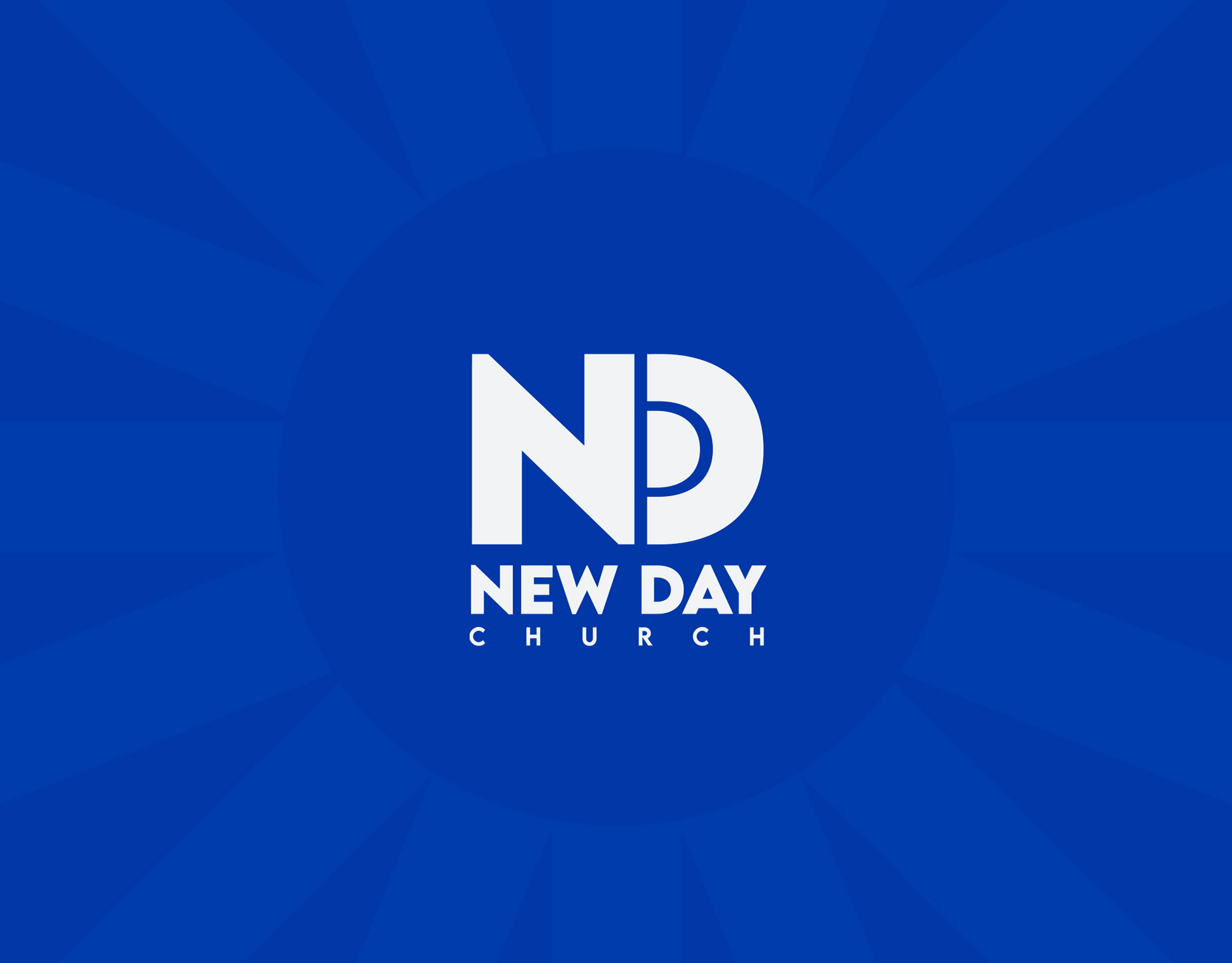
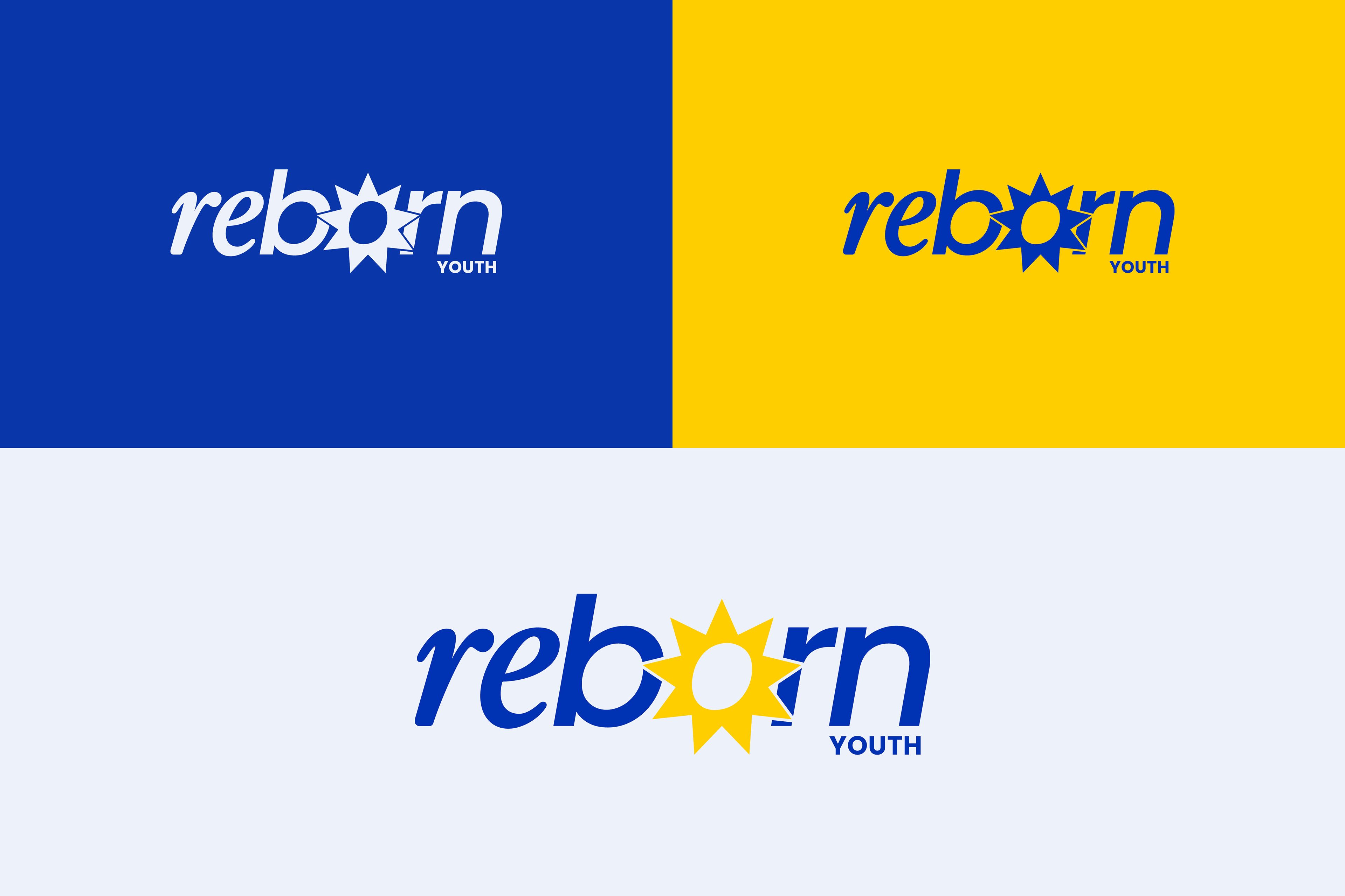
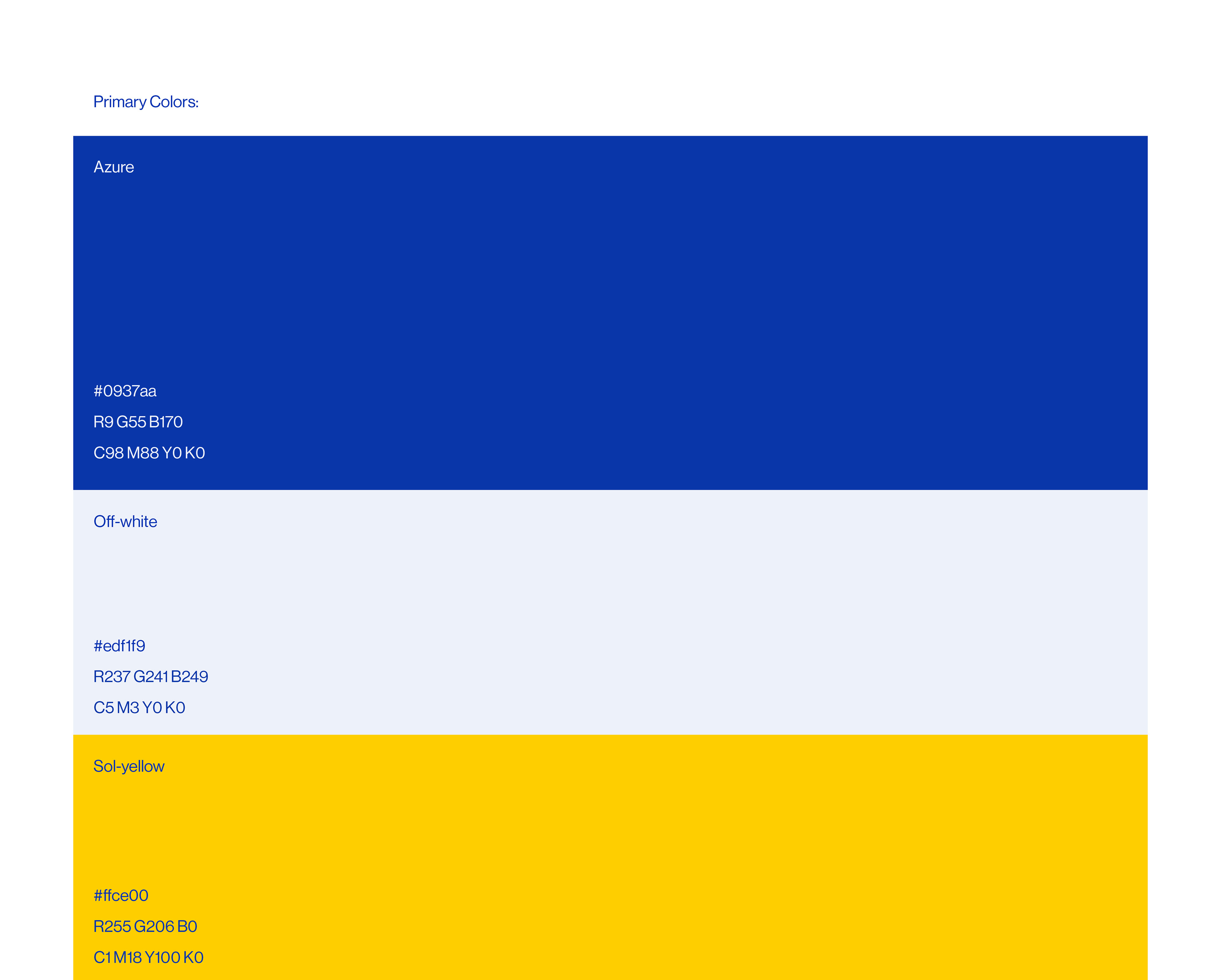
The finalized logo we settled on, depicted below, seamlessly integrates our vision. We maintained the "re" in a serif font, contrasting elegantly with the sans serif "born." However, a notable addition is the incorporation of a sun motif replacing the "o." This addition not only aligns with the essence of New Day Church but also symbolizes renewal and rebirth, echoing the concept of a new day and being born again. The choice of primary colors was Azure (blue), sol yellow, and off-white.
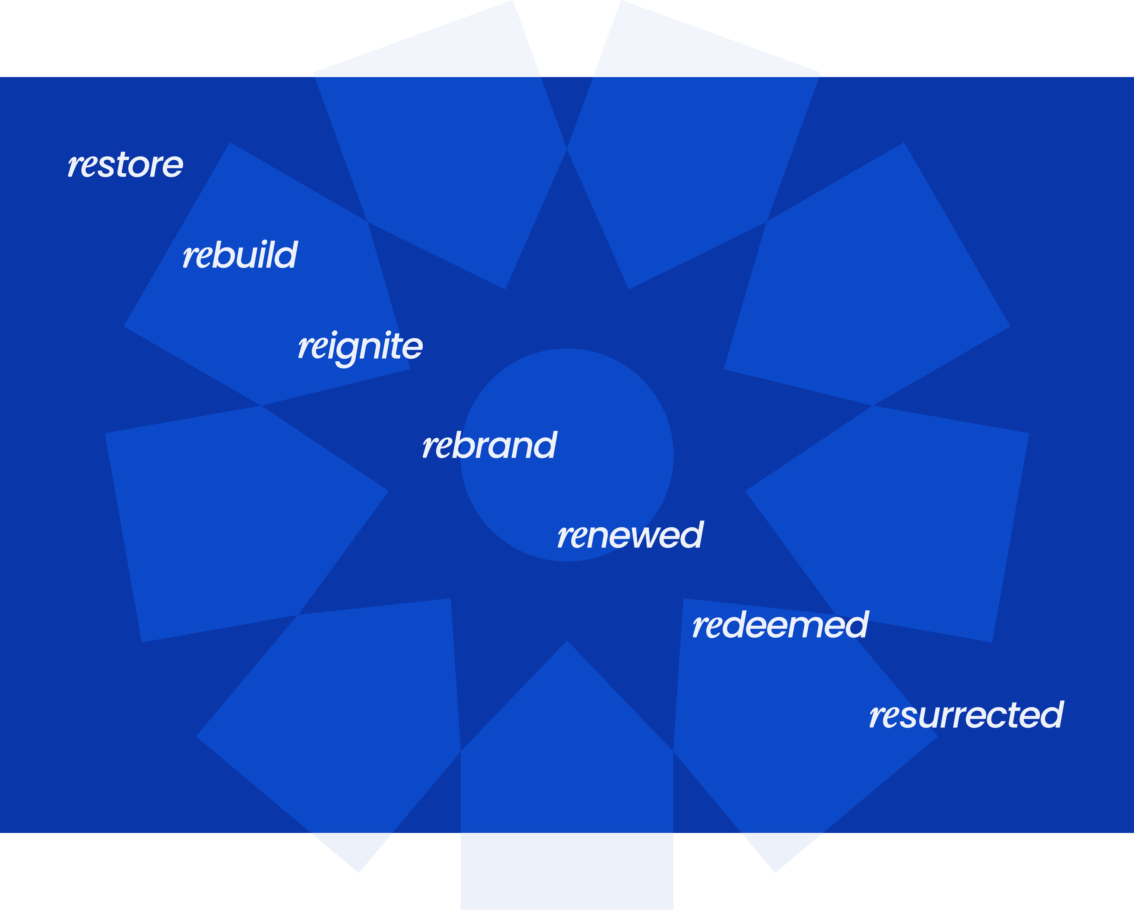
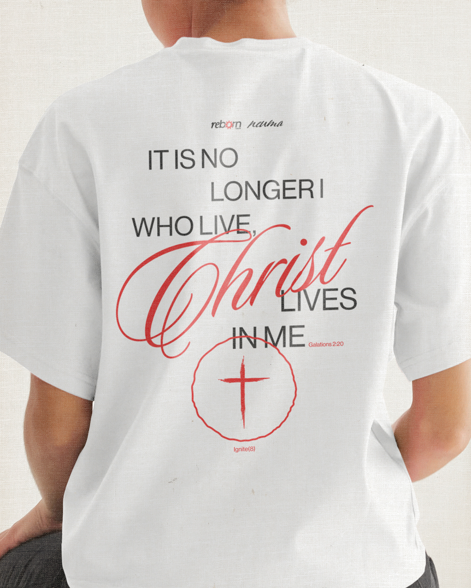
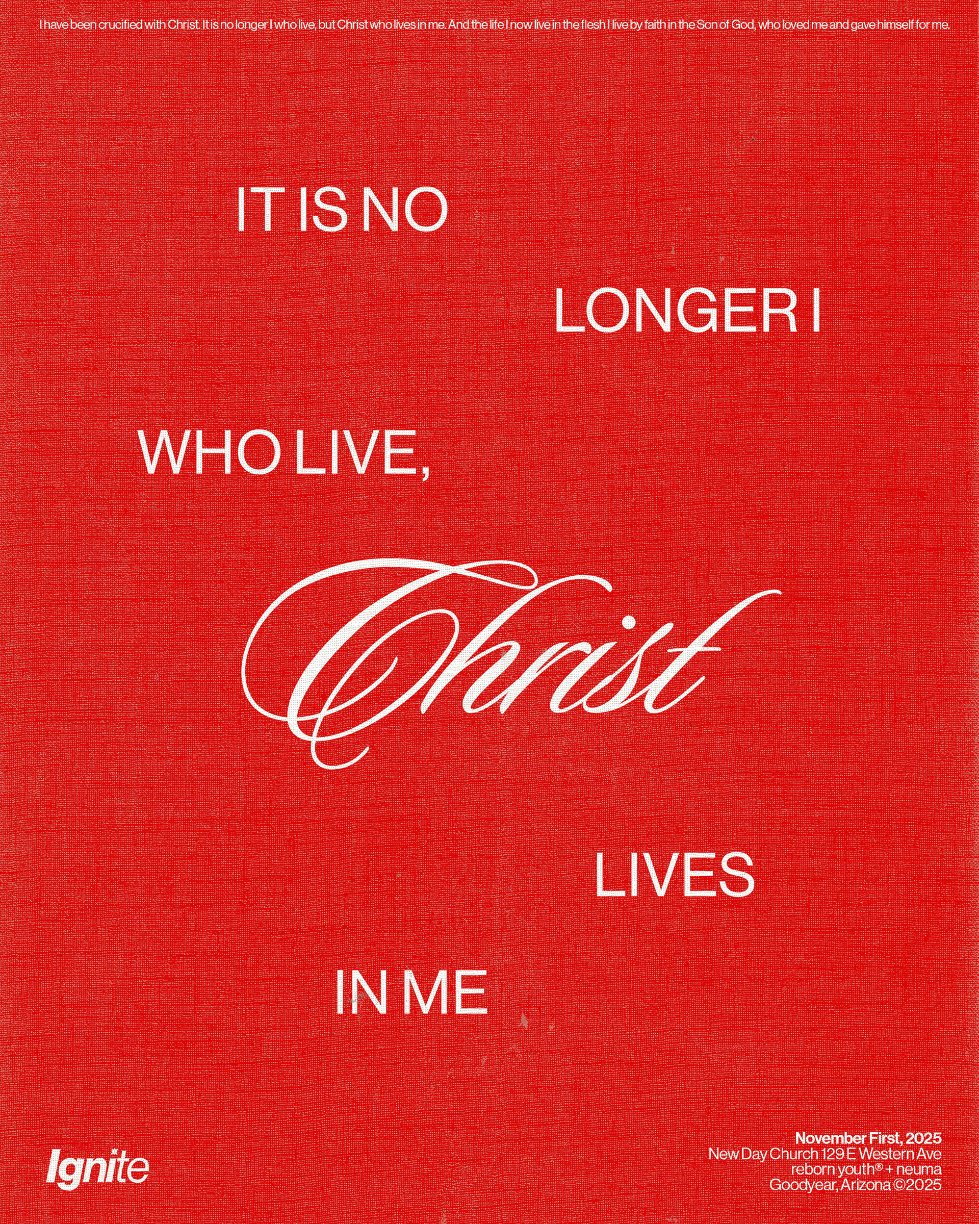
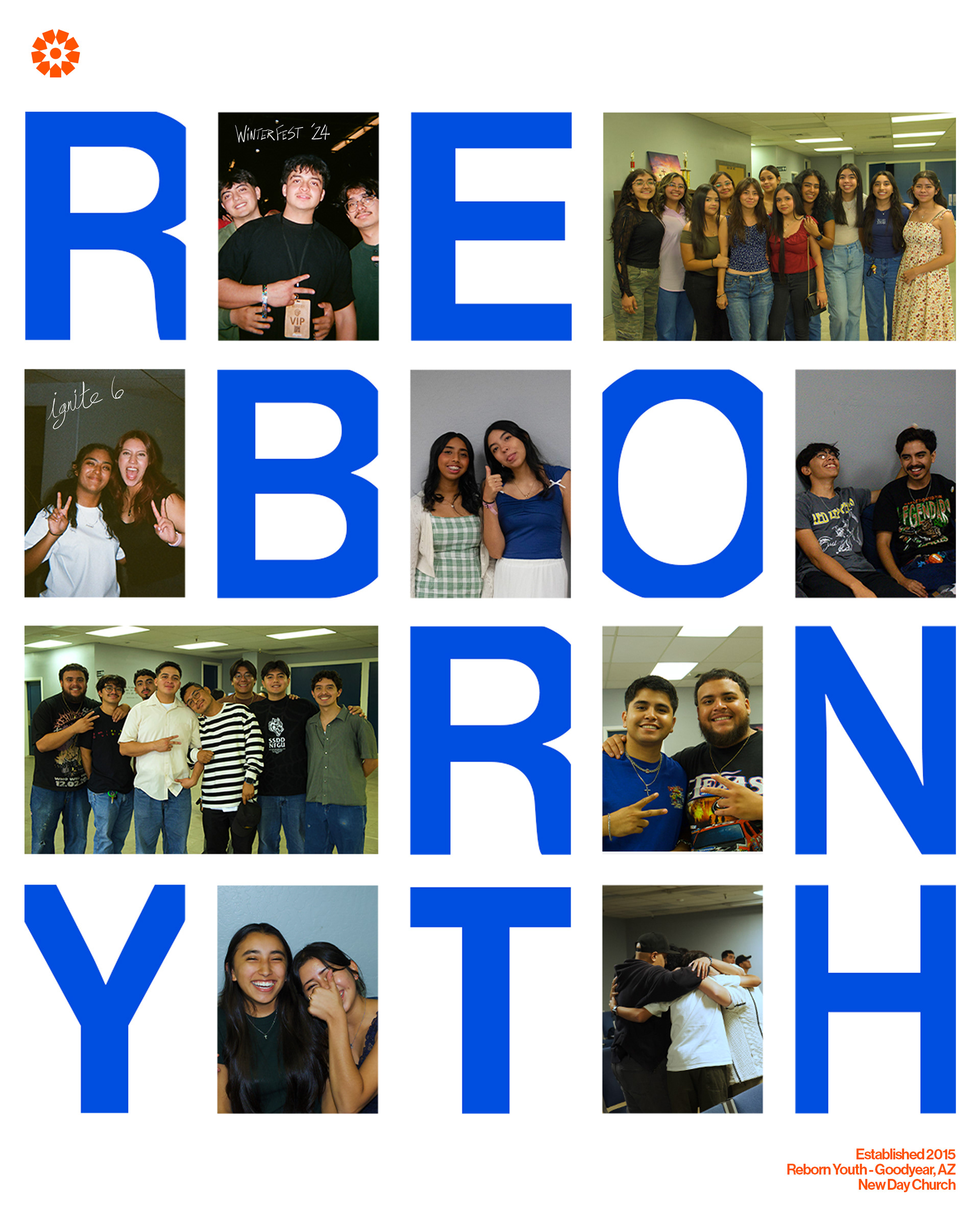
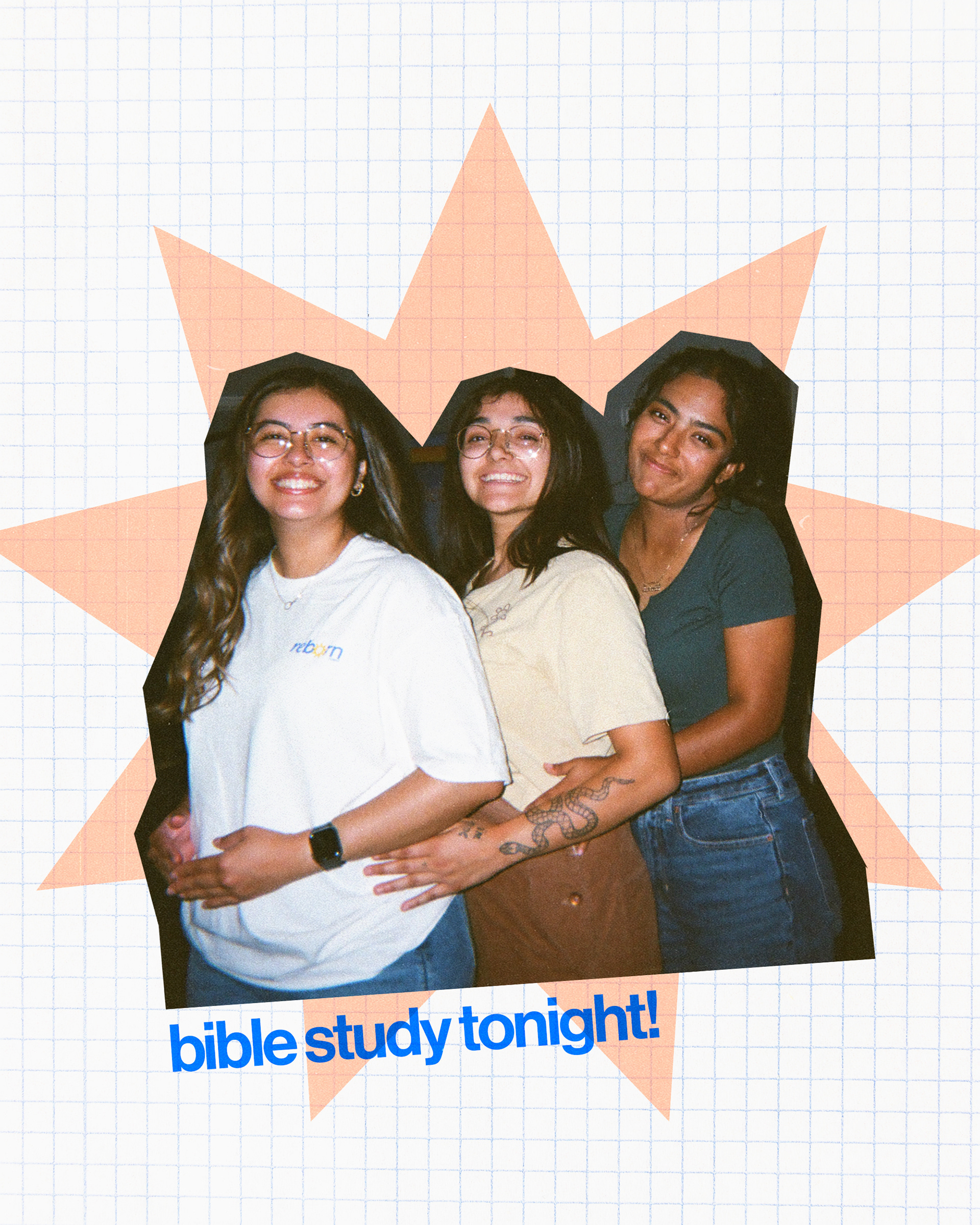
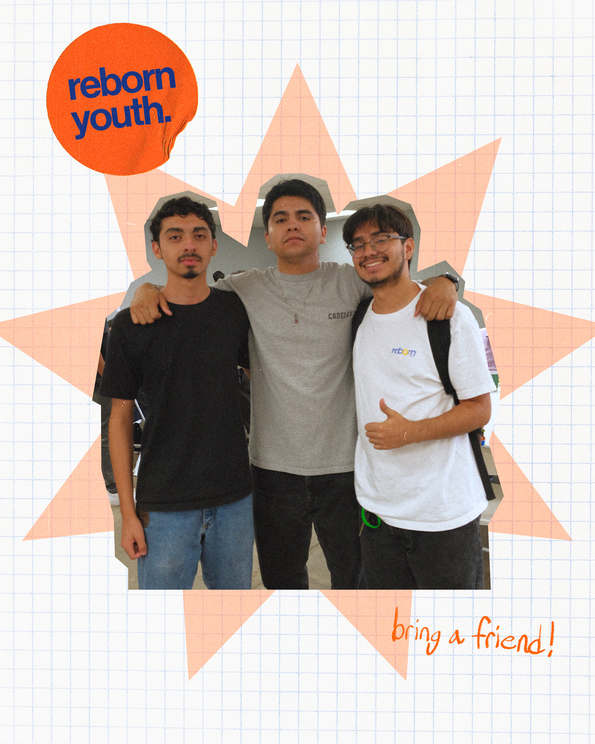
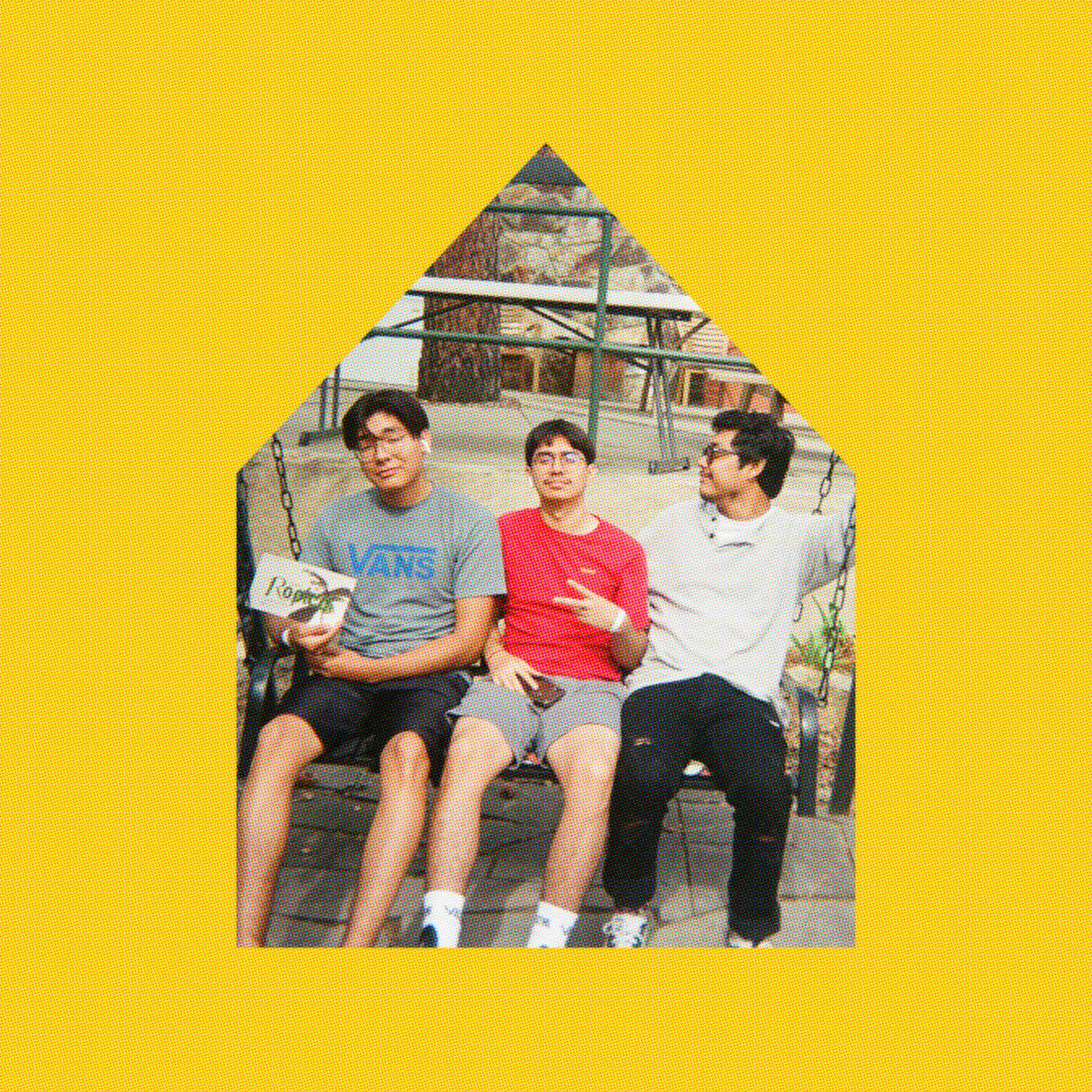
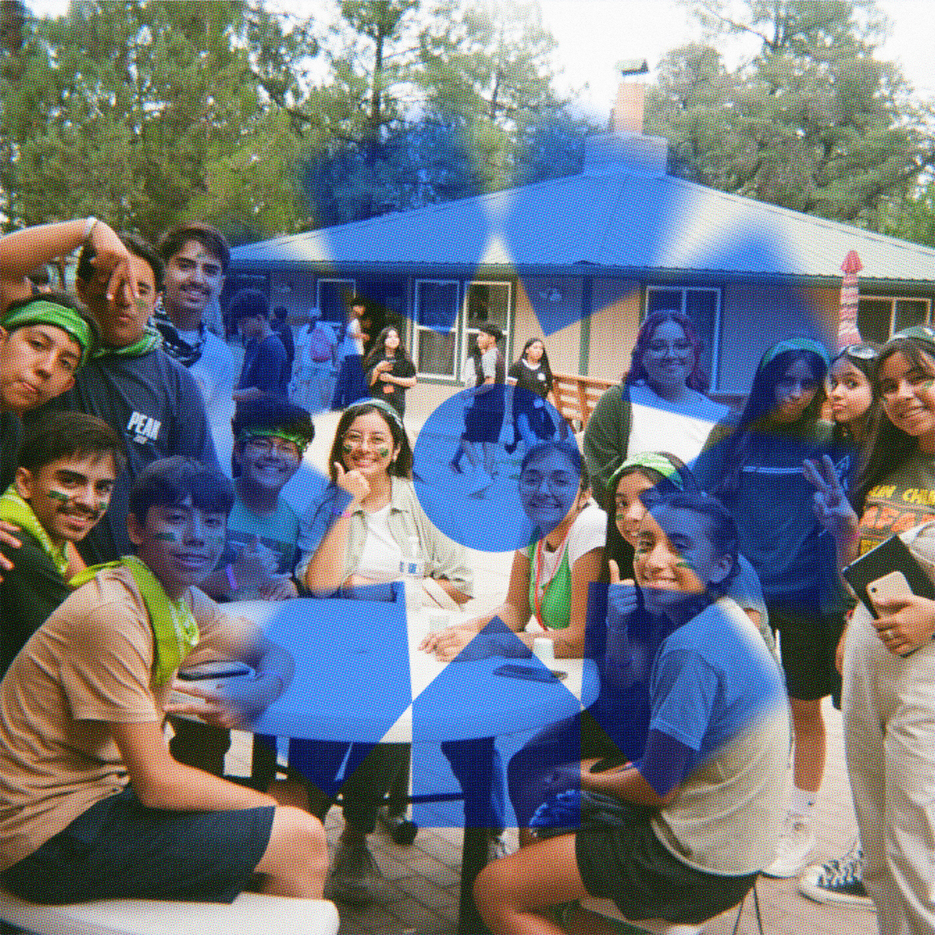
Mission statement: "Reborn is the awakening to the truth that each New Day offers a fresh start-a chance to be born again. It is a call to reignite the flame within, restore our spirits, and rebuild our lives with purpose. Through this journey, we are renewed by the transformative touch of God and His everlasting presence. Our pasts serve as reminders of growth, propelling us forward. In this cherished community, your story is valued, and you are embraced as family. Our lives are transformed and redeemed by the grace and power of God, guiding, uplifting, and restoring our souls. Embrace the constant presence of God as we embark on a lifelong pursuit of growth, restoration, and renewed purpose in each New Day".